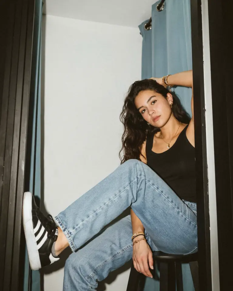
I first discovered film presets for Lightroom Mobile while trying to make my fall outfit selfies look less flat and more Y2K. Living near the city and constantly shooting in front of brick walls, coffee shops, and subway stations, I needed edits that could handle both harsh daylight and moody evenings. After testing dozens of presets on my own photos, I found ten specific adjustments that actually work for fall layers, patchwork jewelry, and that specific ‘that girl’ city vibe. These are the ones I keep coming back to, and they might change how you shoot your autumn looks too.
Why I Turned to Film Presets for My Fall City Outfits
Last October I tried to replicate a grainy, warm look by sliding every Lightroom slider up and down. The results were either orange cast or weird purple shadows. That is when I started building my own film presets for fall city outfits. The trick is balancing color temperature so the browns and ochres of autumn clothes don’t turn into a blob. I use a slight green tint in the shadows to separate a camel coat from a brick background. This also keeps black jeans from looking washed out. For city backdrops with asphalt and concrete, a little desaturation on the blues makes the whole frame feel cohesive.
The 10 Edits That Actually Work with Autumn Layers
After shooting in five different locations across two weekends, I narrowed my go-to adjustments to ten key moves. These are not presets you buy, but settings you can save as custom presets in Lightroom Mobile. Here is my actual formula:
- Raise exposure by +0.4 but lower highlights by -25 to keep sweater textures soft
- Add +15 to contrast, then pull shadows up by +20 for that washed film look
- Shift white balance to 5400K with a +5 tint (green) to neutralize orange skin
- Drop clarity to -10 and increase dehaze to +5 for a matte finish on outdoor portraits
- Use the HSL panel to desaturate blues by -30 and shift greens toward yellow by -15
- Add a radial gradient over your face with +0.3 exposure and +10 warmth
- In the effects tab, add 25 grain and make it slightly rough (size 40)
- Crank up the blacks curve a tiny U shape for that Y2K digital camera feel
- Use a linear gradient from the sky down to darken the top third of the frame by -0.5
- For patchwork jewelry: bump clarity on the accessory area by +15 using a brush
These ten edits take about 90 seconds per photo after you save them as a preset. I named mine “Fall City Y2K.”
How I Edit NYC Street Style Photos on My Phone
NYC street style is a beast because the light changes every block. One minute you are in dappled tree shade, the next you have direct sun bouncing off a glass building. Editing NYC street style on Lightroom Mobile forced me to stop relying on auto white balance. Instead, I shoot in RAW whenever possible. Then I apply my Fall City Y2K preset and use the selective color adjustment tool to tweak only the red tones of a brick wall or the yellow of a taxi. The key is not to overdo it. I leave the preset at 80% opacity and manually adjust exposure for each shot. That way all photos in a carousel look consistent without being cloned.
Making Y2K Tones Work with Modern Wardrobe Pieces
Y2K trends these days mix frosted eye shadows with chunky sneakers and oversized blazers. The challenge is keeping the vintage film feel without making your puffer jacket look like it was shot on a 2002 Kodak disposable. I found that applying Y2K Lightroom presets for modern fall style requires dialing back the red channel by about 10 points. Red tends to bleed into synthetic fabrics and create hot spots on shiny outerwear. Instead, let the preset warm up the skin and leave the clothes slightly cooler. For knitwear and denim I add a subtle vignette (around -15) to pull attention to the face and top half of the outfit.
My Go To Settings for Sunglasses and Butterfly Motif Shots
Sunglasses in fall selfies are tricky because the reflection can throw off your edit. I always take a test shot without glasses, apply my preset, and then manually match the color balance for the glasses shot. For Lightroom settings for sunglasses and butterfly motifs, I use a soft brush to reduce clarity on the lenses by -5 so the reflection looks dreamy instead of harsh. Butterfly motifs, whether on earrings or a printed top, pop best when you add +10 vibrance but only on the red and magenta channels. This makes the iridescent details catch the eye without overwhelming the whole image. I often add a tiny
Leave a Comment