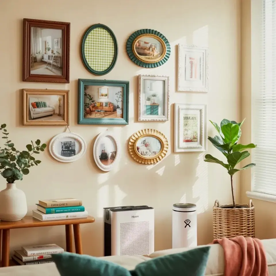
I still stop and stare at it every single time I walk past. It started as an accident, a pile of mismatched frames I refused to throw away, and it turned into the coziest corner of my entire house. The cozy gallery wall with vintage frames and eucalyptus honestly became my favorite thing I have ever hung on a wall. I did not plan it, I did not measure a single thing before starting, and somehow that is exactly why it worked.
The wall sits next to a window with those simple white horizontal blinds, and the natural light hitting the glass makes everything feel softer. The frames are all different shapes and colors, brown wood, green gingham, a teal scalloped one, a few oval ones, and they somehow hold the whole room together. Every photo inside is just a little interior scene, a living room with a plant, a chair by a window, small moments I collected over time.
Why a Mismatched Gallery Wall Works Better Than a Matched Set
We have all seen the perfectly uniform gallery walls, same frame, same mat, same size, repeated ten times. They look polished, sure, but they can feel a little cold. Mismatched frames bring in personality. They tell a story of flea markets, thrift stores, and hand-me-downs from people you love.
I started with a single brown wooden frame, the kind my grandmother probably had in her hallway. I added a green gingham frame, which sounds weird on paper, trust me I know, but it brings a country-kitchen warmth that stops the wall from feeling too serious. The teal scalloped frame is the wild card. It adds a pop of color, and even though it does not match anything else in the room, it somehow makes everything else look intentional.
Here is the thing about vintage frames. They do not need to match because they share the same soul. They have lived previous lives and gathered little scratches and worn corners. That history creates a visual rhythm that new matching frames simply cannot replicate.
Choosing the Right Wall and Setting the Mood
Not every wall is meant for a gallery. I tried mine on a large blank wall in the hallway first, and it looked lost. The arrangement needs a boundary, a piece of furniture below it, or a window beside it, to anchor the whole composition.
My favorite spot ended up being beside the window. The white horizontal blinds let in soft, diffused light, which makes the cream-colored paint look warm instead of stark. The window frames the gallery on one side, so the eye has a natural place to rest. In the afternoon, the light hits the glass of the frames and casts tiny shadows that shift as the sun moves. It is a small effect, but it changes the whole mood of the room.
You want to find a wall that gets at least some natural light. A dark corner will swallow all the details in the photographs. You also want a wall that you pass by often. There is no point creating something beautiful if you only see it when you have guests over.
The Perfect Mix of Vintage Frames and Photographs
The secret is not the frames alone, it is what you put inside them. I filled my gallery with interior scenes, small photographs of living rooms with plants, a cozy reading nook, a table set for dinner. The photos are not of people. They are rooms, which sounds a little odd, but it makes the wall feel calm and collected.
Here is what I found works best when you are gathering your own pieces:
- Mix oval frames with rectangular ones, it breaks up the straight lines and keeps your eye moving
- Include at least one colored frame, like the green gingham or teal scalloped one, to add warmth
- Use photos with similar tones inside the frames, muted colors, plants, natural textures, so the whole wall feels cohesive
- Leave small gaps between frames, about two inches, so the wall does not feel crowded
- Throw in one odd piece, a tiny drawing, a pressed flower, a quote, to surprise the viewer
The sequence matters more than the individual pieces. I placed the brown wooden frame as the anchor, slightly off-center. The teal scalloped frame sits higher, almost like an accent mark. The oval frames fill in the gaps between the larger rectangles, creating a bridge between all the different shapes.
When it comes to photography, black and white prints inside vintage frames look timeless. But do not be afraid of color prints, especially if they feature greenery. My favorite photo in the whole collection is a small shot of a monstera plant in a terracotta pot. It is not a fancy photograph, but it brings life to the wall.
Hanging the Gallery Wall Without Losing Your Mind
Okay, let us talk about the actual hanging process. I laid all the frames on the floor first, which I recommend doing even if you think you have a plan in your head. I arranged and rearranged them until I found a shape that looked balanced. Then I took a photo of the floor arrangement with my phone, so I had a reference to look at while I worked.
I did the classic paper template trick. Trace each frame onto parchment paper, cut out the shapes, and tape them to the wall. It sounds tedious, but it saves you from hammering 47 nail holes into your wall. You can step back, look at the layout, and move the paper around until it feels right.
Not gonna lie, I still ended up with two extra nail holes that I had to fill with toothpaste because I was too lazy to go to the store. The toothpaste worked, but maybe buy some spackle before you start. Once you are happy with the templates, mark the top center of each one, remove the paper, and start hanging your frames from the anchor piece outward.
Here is a practical tip. Use a level, but do not obsess over it. If one frame is slightly crooked, it will feel charming and handmade. If all of them are crooked, it feels chaotic. Try to get the big pieces straight, and let the smaller ones fall where they naturally land.
Adding the Eucalyptus Branch for a Natural Touch
When I first hung the gallery wall, it felt complete. Good. Correct. But it also felt a little dry. The green in the gingham frame helped, but the wall needed something living next to it. That is when I added the white ceramic vase with eucalyptus branches, and everything changed.
The eucalyptus sits on the left side of the wall, and it does not compete with the frames. It softens the edge, brings actual organic texture to the space, and adds that gentle green-gray color that makes vintage frames look even more worn and loved. The branches are not tall or dramatic. They are just present. They bend slightly toward the frames as if they are leaning in to look at the photographs.
Real eucalyptus dries beautifully, so you do not have to replace it every week. I have had the same branches in that vase for over two months, and they still look good. They have faded to a softer sage tone, but that honestly looks even better against the cream wall. If you want a low-maintenance version, you can find convincing artificial eucalyptus at craft stores, but there is something about the real thing that feels more alive.
The vase itself is simple and white. That was a deliberate choice. I could have used a patterned vase, but the wall already has so much going on. The white ceramic lets the eucalyptus be the star while still giving the gallery wall a solid base to rest on visually.
Give Your Gallery Wall Room to Breathe
The biggest mistake people make with gallery walls is trying to fill every inch of space. You do not have to cover the entire wall from floor to ceiling. A gallery wall does not have to be huge. The size should relate to the furniture and the architecture around it. With a window on one side, the gallery has a natural stopping point, and you should let the empty space on the other side balance it out.
When you step back, your eye should travel across the photographs, pause on the eucalyptus, and then rest on the window. It is a gentle little loop. The empty wall space is not a mistake. It is what allows the gallery to actually be appreciated instead of becoming overwhelming wallpaper.
I would also suggest playing with the height. Do not feel like every frame has to hang at eye level. Some of my frames sit lower, and some sit higher, and the varied heights give the arrangement a relaxed, lived-in feel. It feels like a wall that grew over time, not one that was installed by a professional designer with a laser level.
If you are starting from zero, begin with just three frames. A large one, a medium one, and a small one. Get them on the wall and live with them for a few weeks. Then add more slowly. That is how you avoid a stiff, planned-out look. That is how the wall develops its own personality.
Final Thoughts on Building Your Own Cozy Corner
That little arrangement, the frames, the eucalyptus, the cream wall, the window light, it has completely changed how the room feels. It is the first thing my eyes go to when I walk into the space, and it is the last thing I look at before I leave the room. It does not match my furniture perfectly, and honestly, that is why I love it.
The process taught me to trust my instincts. Your own combo of vintage frames, odd photographs, and eucalyptus might look entirely different from mine, and that is exactly the point. Start with what you own, what you found, and what you love. Get it on the wall and let it evolve. I hope you build a little cozy corner of your own, and if you do, I would love to know what ended up on your wall. Leave me a comment or pin your version, there is always room for one more beautiful mess.
Leave a Comment