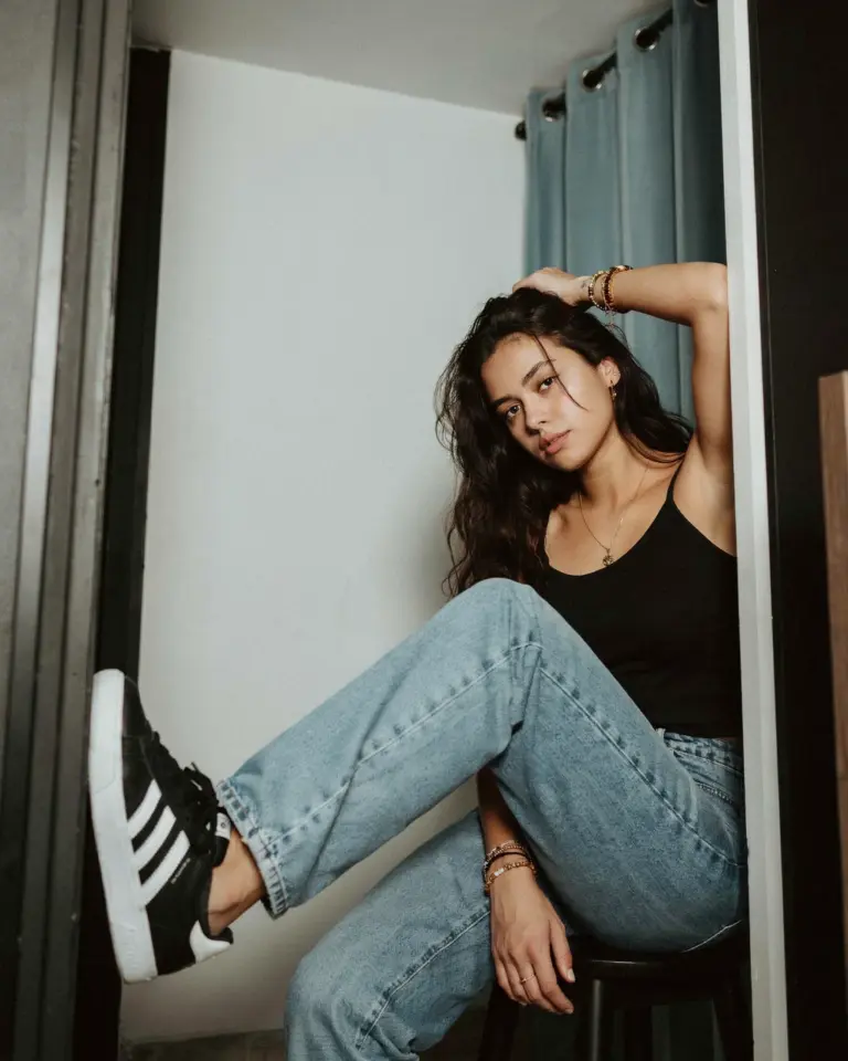
Maya stopped mid-stride on the Manhattan Bridge, the sunset turning the skyline behind her into a hazy orange mess, and handed me her phone. “Make it look like film,” she said. Not a suggestion. A demand. So I opened up my Lightroom mobile app, tapped my Y2K preset pack, and watched the concrete and steel around her soften into something nostalgic and slightly grainy. That one tap took the photo from a casual tourist shot to a piece of the mood board we had been chasing all weekend.
Film presets for Lightroom mobile are honestly the fastest workaround I have found for that specific, late-90s digital camera feeling. I don’t mean the clean, perfect film look you see on professional cameras. I mean the slightly blown-out, flash-heavy, low-quality aesthetic that makes a phone picture look like it was taken in 1999 and forgotten in a shoebox. This app preset collection has been sitting in my gallery rotation for months, especially for summer night selfies and chaotic best friend photo dumps. The Y2K vibe is unmatched when you are shooting against a brick wall covered in graffiti or standing outside a bodega at 11 PM.
How I Actually Use Film Presets for Lightroom Mobile Editing
Ok so here is the thing, I am not a professional editor. I am a person who takes roughly four hundred pictures of her friends every time we leave the apartment, filters them, and posts maybe ten. The preset pack I use does most of the heavy lifting, but I always make a few manual tweaks after applying it.
I lower the clarity slider, but just a tiny bit. Like, negative 5. That alone kills the harsh digital sharpness that smartphones love to add. Then I go into the grain settings and punch it up to around 30 or 35. The grain in Lightroom mobile looks way more organic than any IG filter I have tried. It actually sits on the skin and the fabric of your clothes like real film grain, instead of just adding a static-y overlay on the whole image.
Here is a quick rundown of my non-negotiable moves when editing a selfie or outfit pic with these presets:
– Crank the grain, but don’t touch the size slider, leave that alone.
– Pull the black point down so the shadows get that murky, messy depth.
– Add a slight warm tint to the highlights, especially if the photo was taken under a streetlight.
– Don’t overdo the exposure, you want the picture to look naturally bright, not artificially lit from within.
Why Y2K Aesthetic Presets Suit City Lights and Summer Nights
The Y2K aesthetic on my phone is basically a love letter to cheap point-and-shoot cameras and the weird glow of a city after dark. When you apply a film preset to a photo taken on a summer night, the streetlights and neon signs start to bleed into the surrounding darkness. It creates this halo effect around the lights that you simply cannot replicate with a standard editing filter.
I have a specific memory of sitting on a fire escape with my friend, both of us sweating in the July heat, trying to get a picture of our new outfits. The only light source was a flickering sign across the street. The raw photo was a disaster. Shadowy faces, weird color cast, basically a black rectangle. Then I applied the preset and suddenly the darkness looked intentional, the flickering sign cast a pink glow over everything. It looked like a scene from a coming-of-age movie.
The grain is the secret sauce for this look. It hides the fact that you are shooting in low light with a tiny sensor and gives everything a cohesive, uniform texture. The photos all start to look like they belong together in the same album, even if you took one in a subway station and one on a rooftop garden. That consistency is what makes an Instagram grid look curated without looking overly designed.
Turning NYC Outfit Ideas Into Selfie Inspo You Actually Post
Walking around SoHo or the Lower East Side gives you more outfit ideas than any Pinterest board ever will. But capturing that inspiration on your phone is tricky because the background is usually busy with other people or ugly scaffolding. The film preset helps you isolate the subject, which is you or your friend in a cool jacket, by muting the contrast of the background chaos.
For my last trip into the city, I wore this silver metallic slip skirt with a chunky white sneaker and a pair of tiny sunglasses. My friend wore baggy cargo pants and a cropped baby tee. We took turns shooting each other against a dirty, pale-yellow wall. The preset made our skin tones look sun-kissed even though we were standing in a shadow, and it gave the silver skirt this reflective, liquid quality that looked so good in the final photos.
Here are some quick NYC outfit ideas that translate really well into this specific editing style:
– A leather jacket over a slip dress, with clunky platform boots.
– Head-to-toe denim, but make the wash super light.
– An oversized graphic tee with bicycle shorts and a small shoulder bag.
– Anything with a chain belt or a low-rise waistline.
Getting That Tattoo Inspiration Look Without Losing Detail
You might think adding grain would ruin tattoo photos, but honestly, it does the opposite. Heavy grain actually softens the minor skin imperfections while keeping the bold lines of the ink looking sharp. I was worried that my friend’s sleeve tattoo would turn into a muddy blur when we applied the preset, but the structure slider in Lightroom mobile kept the black lines crisp.
The trick for tattoo inspiration pics is to use a preset that doesn’t crush the blacks too hard. You still want to see the shading and the little details in the design. I usually export a version of the photo with slightly lower grain if the tattoo is the main focus, or I keep the grain high if the tattoo is just part of a bigger outfit grid. Both look good, just depends on the vibe.
We spent an hour shooting Maya’s new snake tattoo winding around her forearm. We used the flash on the phone, which is usually a bad idea, but the preset adjusted the color temperature so the flash looked like a camera flash from the early 2000s, not a harsh modern LED. The tattoo looked bold against her skin, and we got some of the best selfie inspo of the whole trip from that session.
My Best Friend Photo Formula for the Perfect Feed
Capturing the chaos of a night out with your best friend is hard because you are both moving, laughing, and probably holding snacks. The photos are usually blurry or the composition is all wrong. I stop fighting it. I lean into the blur. The film preset makes a slightly out-of-focus photo look candid and artistic rather than just broken.
We have a formula now. You stand in front of a cool but simple background, like a closed metal shutter or a tiled subway entrance. You hold the camera low, around chest height, pointing slightly upward. One person looks at the lens, the other looks away, pretending to scan the street. Snap like five photos in a row. One of them will have the perfect smile or the perfect hair flip.
When you apply the Y2K preset to this burst of photos, they all get this unified mood. The grain covers up the fact that you are wearing the same makeup you have had on for nine hours. The color grading makes the sweat on your forehead look like a dewy highlight. It is genuinely flattering. The film look is forgiving in a way that modern HD clarity is not.
How to Filter Your Lightroom Mobile Presets for Different Vibes
I don’t use the exact same preset for every single photo, even within the same album. The preset pack I have includes variations, some are more contrasty and sharp, some are softer and more pastel. For a daytime outfit photo near the river, I use the softer one. For a moody, late-night picture under a bridge, I use the contrasty one.
It is worth taking five minutes when you first download a pack to test each preset on the same selfie. Just duplicate the photo and scroll through them all. See which one makes your hair look shiny, which one makes your jacket look saturated. Keep those favorites in a starred collection in Lightroom mobile. That makes accessing them during a photoshoot way faster than digging through the whole menu.
My current favorite is the one that mimics a disposable camera with a slightly green tint in the shadows. It is perfect for outdoor summer photos, especially where there is a lot of greenery or concrete. It gives the picture that slightly dated, nostalgic feel without pushing the colors into the orange and teal territory that every other preset pack on the market seems to use. That orange and teal thing is so overdone, it looks like a video game.
Where to Find Presets Without Paying for a Whole Education Course
You do not need to buy a 500 dollar preset pack or subscribe to some influencer’s premium app to get this look. I have used free packs from smaller creators and I have bought cheap ones from Etsy for a few bucks that work just as well. Look for keywords like “Y2K film” or “disposable camera” on Etsy or the Adobe community gallery.
When you download a preset, make sure it is a DNG file that actually comes with instruction for importing. The mobile app imports these from the camera roll or a file sharing app. If you struggle with it, watch a YouTube video for the specific file type you downloaded. It takes two minutes. You just open the DNG file in Lightroom mobile, go to the presets tab, find the ellipsis menu, and hit “create preset.”
Honestly, you could even make your own with the sliders, but buying the pack saves you the guesswork. The files are so cheap that it is worth skipping the trial-and-error phase. Then you have all the tools to start experimenting right away.
Look, I am never going back to spending twenty minutes manually editing the colors on every single photo. Having those film presets ready to go in Lightroom mobile changed how I document my life. It makes the process faster, the photos look better, and I actually post things instead of leaving them stuck in my camera roll. Go get a preset pack, grab a friend, and walk around until the streetlights turn on. The pictures will take care of themselves.
Leave a Comment