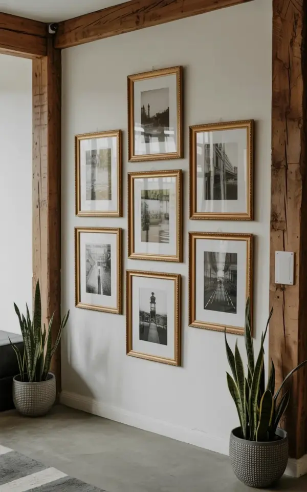
Seven frames. One wall. A grid so tidy it feels like a gallery curator arranged it, except this one is in a photo studio, and honestly, the whole look is deceptively simple. A gallerywall is one of those interior styling projects that looks like it took a professional team, but the reality is, you can pull it off with a measuring tape, a level, and an afternoon of patience. The photo we are working with is a perfect blueprint. It shows seven black and white photographs in ornate gold frames, arranged in a neat three-two-two pattern on a white wall. The rustic wooden beams above add a touch of warmth, and the polished concrete floor keeps everything grounded and modern. This is the exact setup we are going to break down, step by step.
Why a Grid Layout is the Best Starting Point for a Photo Wall
If you have never arranged a photo wall before, (and that is completely fine), a grid is your best friend. It does the thinking for you. The gold frames are all different sizes but they fit together like a puzzle, which creates a structured look that is easy on the eyes. A symmetrical grid gives the space a sense of order, which is especially important in a photo studio where you want the focus to be on the work, not the clutter.
Compare that to a salon style wall, which is intentionally scattered and casual. A grid is the opposite. It says you meant to put every single frame exactly where it is. For this project, the grid is anchored by a large square frame in the center, with two vertical frames on the far left and far right. The remaining frames fill the gaps. This is not a random assortment, it is a deliberate composition that any beginner can replicate with a little planning.
How to Mix Urban, Nature, and Architecture in Black and White Photography
The beauty of a black and white photo wall is that it forgives almost every mistake. Color complicates things. It clashes, it demands attention, and it makes matching frames harder than it needs to be. Black and white photography simplifies the visual noise, allowing the textures and shapes of the subjects to take center stage. In the photo, you can see urban landscapes, nature shots, and architectural details all hanging side by side, and they work because the monochrome palette unifies them.
Here is the thing about mixing subjects. You do not need a cohesive theme. That is the trap. Instead, think about contrast and tone. A moody shot of a city street can sit next to a delicate leaf because they both have strong blacks and soft whites. The architecture shot gives the wall structure, the nature shot brings some softness, and the urban shot adds a bit of grit. The visual variety keeps the eye moving. If you only hung nature photos, the wall would look like a botanical catalog. If you only hung architecture, it might feel cold. The mix is what makes it interesting.
Balancing the Composition with Snake Plants and Everyday Objects
Look at the photo again. The wall is not the whole story. The two identical snake plants in textured gray pots anchor the entire display. They ground the wall, keeping it from floating awkwardly in the middle of the room. This is a classic interior styling trick. You balance the vertical lines of the wall (the frames) with the horizontal spread of the plants. The snake plant leaves extend outward and slightly downward, which softens the hard edges of the gold frames.
You might not have snake plants on hand, and that is okay. The principle is what matters. You want something on either side of the wall to visually bookend the frames. It could be a pair of floor lamps, a couple of tall vases, or even two mismatched chairs that share a similar height. The goal is to create a triangle of interest. Your eye goes from the plant on the left, up to the wall, and down to the plant on the right. It is a stable, pleasing shape that makes the whole arrangement feel intentional. That is the secret to making a photo wall feel like it belongs in a studio rather than just a hallway.
How to Measure and Hang Seven Frames Without Breaking a Sweat
Let’s get practical, because hanging frames is where most people abandon the project. Here is a simple method. Lay all seven frames on the floor first. Arrange them exactly how you want them on the wall. Measure the total width and height of this arrangement. Then, mark the center point of your wall and work outward from there. This prevents you from ending up with a row that drifts off to one side.
– Use painter’s tape to create a rectangle on the wall that matches the dimensions of your layout.
– Measure the distance between each frame and keep it consistent, usually two to three inches.
– Use a laser level if you have one, but a cheap bubble level works fine for a grid.
– Hang the center frame first. Everything else builds out from that anchor point.
– Do not trust your eyes alone. Measure twice, hang once.
I have a mild obsession with measuring, but honestly, it saves you from the most annoying problem of all: a wall that looks slightly crooked no matter what you do. And if you are using ornate gold frames, you want them to be perfectly aligned because they are decorative. The gold draws attention to the lines, so a small tilt in the frame becomes a big flaw. Take your time.
Adapting This Gallery Wall for a Living Room or Office Space
This exact setup can leave the photo studio and work beautifully in a home. The industrial vibe of the polished concrete floor and the rustic beams are specific to that room, but the rest of the look is portable. If your living room has a standard drywall wall and a wooden floor, the grid will still pop. You just need to adjust the surrounding furniture.
A sofa is a great replacement for the empty floor space. Place the wall directly above the back of the couch. The rule is to leave about six to eight inches between the top of the sofa and the bottom of the frames. That distance keeps the wall feeling connected to the room without being cramped. In an office, you could place a desk below the grid. The black and white photography adds a level of sophistication that keeps the space professional but not boring. The snake plants might translate to a pair of small shelf plants if floor space is tight.
Styling Tips to Make the Gold Frames and Black and White Prints Shine
The gold frames in the photo are ornate, which means they are not shy. They have detail and they reflect light. To make them shine, you need to control what else happens in the room. The white wall is essential. It provides a clean backdrop. The black and white photos are essential too, because if you used color photos, the gold and the color would compete for attention. The matting inside the frames matters just as much. A bright white mat gives the photo a little breathing room and makes the print look more expensive.
One detail that often gets overlooked is the lighting. In the photo, there is soft, even light washing over the wall. If you have track lighting, aim one of the heads at the center of the grid. It will make the gold frames glint. If you only have a ceiling light, that is fine, but be aware that shadows from the frames can distract. A simple picture light attached to the top of the center frame is a trickier setup, so skip it unless you are confident with wiring. The goal is to make the gold feel warm, not glaring.
I spent a whole day once rearranging the same five prints on a wall. I moved them left, right, up, and down. The grid was right all along. Sometimes the simplest arrangement is the one that works best. So get your frames, get your prints, and focus on the spacing. The result will look like you spent a fortune on a designer, when in reality, you just spent a few hours with a measuring tape and a level. That is the best part about this project. It looks expensive but it is completely doable. Now go find your wall and start laying out your frames on the floor. You will be surprised how quickly it comes together.
Leave a Comment