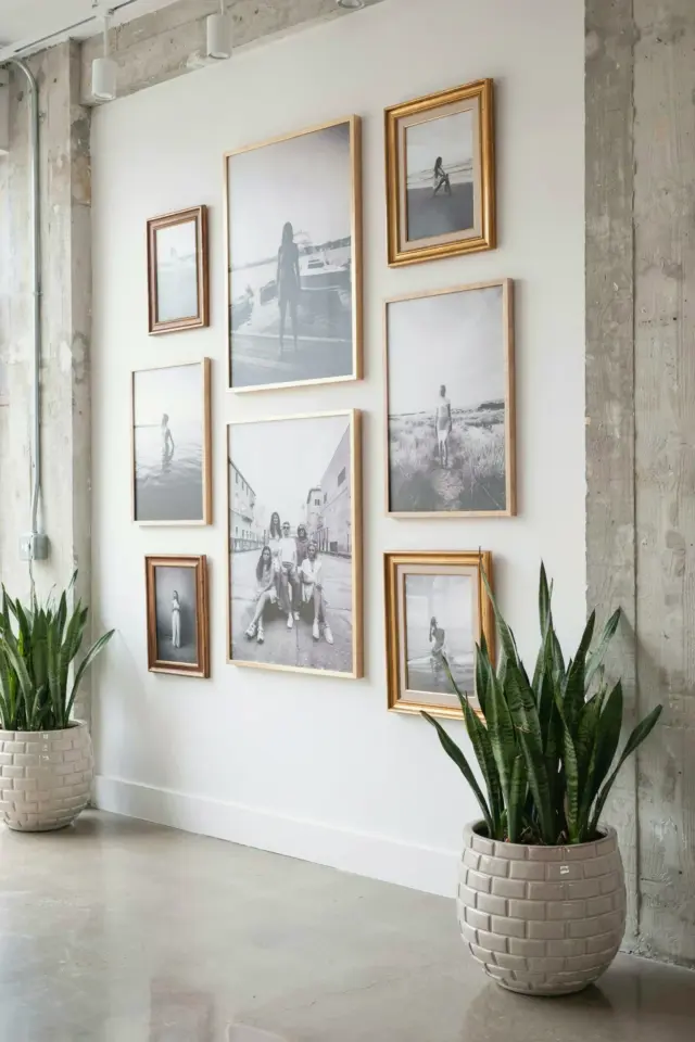
The single biggest mistake I see in photo studio color palettes? It is not picking the wrong accent wall or forgetting to match your props. It is ignoring how paint tones screw with your skin tones and light balance. I learned this the hard way. I painted my first home photography studio a beautiful gentle sage green. Looked like a dream in the can. On camera, it turned every subject a sickly greenish gray. I had to toss half a shoot. So here is the seasonal, trend aware take you actually need, not some textbook color theory.
Why paint undertones mess with your portraits more than you think
A swatch on a white paper card lies to you. It just does. That delicate mauve you love? On your wall, it throws a pinkish hue onto everything. Especially in a small home photography studio where light bounces around like a pinball. I shot a friend’s headshot against what I thought was a neutral warm gray last fall. Her face looked flushed. Like she had run a mile. The wall was reflecting a faint peach tone right onto her cheekbones.
Here is the thing. Your camera sensor picks up color casts your eye learns to ignore after ten minutes in the room. So that wall that reads as “soft beige” to your brain is actually light orange to your lens. And fixing it in post is a nightmare. You end up fighting the color balance all through editing. Honestly, it is easier to just pick the right paint from the start.
Look, I am not saying you have to live in a gray box. But you need to know what a paint is doing to your subject before you commit. Grab a sample board. Paint a big square. Shoot a test portrait against it with natural window light and with your studio lights. That five minute test saves you a thousand edits later.
The 2025 palette shift that actually works for photo studio design mistakes
Trends come and go. I know. But right now, there is a real shift happening. People are moving away from stark whites and cold grays. Fine. But the alternative many are grabbing is worse. They are reaching for warm taupes and muddy browns. And those can be just as punishing to skin tones as the greens and pinks were.
Ok so here is the trend I actually like for 2025. Soft barely there greiges. Not gray. Not beige. Something in between with a neutral blue or green undertone that is almost imperceptible. Think of the color of a cloudy sky at noon. It is not cold. It is not warm. It just sits there and lets your subject be the star. I call it the “does nothing” palette. And that is a compliment.
If you want a specific recommendation? Look at colors with an LRV (light reflectance value) between 60 and 70. That range gives you enough contrast with your subject without creating a bounce light nightmare. Too dark and the wall eats your light. Too light and it becomes a white seamless that shows every dust speck. But I am getting ahead of myself.
How to test wall colors for your home photography studio without wasting a weekend
Do not trust the tiny chip. I mean it. Paint stores give you those little rectangles and you hold them up and think “yeah this is fine.” It is not fine. The chip is too small to show you how the color reacts with your studio strobes or your window light at different times of day. I made that mistake with a lovely dusty blue. Looked great at noon. At 4pm in winter, it turned into a bruised purple.
Here is my real world method. Buy a sample quart. Paint a 2×3 foot patch on the wall you plan to use. Not the same wall as your backdrop. The actual wall that will be behind you or beside the subject. Then shoot it. Use your actual lighting setup. Use a real person if you can, or a mannequin head at least. Check the color cast on their neck and under their chin. Those shadow areas tell you everything.
- Test with your key light at 45 degrees and straight on.
- Test with no artificial light, just window light.
- Test with a reflector bouncing off the wall color if the wall is close to the subject.
- And for goodness sake, test with your camera’s white balance set to daylight, not auto. You need to see what the wall is actually doing, not what the camera is compensating for.
That last point is a sneaky one. Auto white balance will try to fix a bad wall color. So you might think everything looks fine in camera. Then you get home, set your white balance to a neutral gray in Lightroom, and bam. Your wall color shows up as a nasty color cast across the whole image. Frustrating.
Color harmony tips that do not overcomplicate your editing workflow
Alright. You have a neutral wall. Now what about the rest of the room? Your floor, your ceiling, your props, your wardrobe choices? People forget that color harmony is not just the backdrop. It is everything the lens sees. I shot a session last spring where my subject wore a mustard yellow sweater. Lovely color. But my floor was a warm oak hardwood. And my wall was a neutral cream. The combination of warm yellow sweater plus warm floor plus warm wall created this overwhelming golden glow that made her look jaundiced. Not great.
The fix is contrast. Not in a loud way. But your color harmony tips should focus on creating one neutral anchor point and letting everything else play off it. If your wall is a cool neutral, you can bring in warm props and wardrobe safely. If your wall is warm, your props and clothing should lean cool or neutral. It is basic but I see people miss it all the time.
Another thing. Your ceiling paint matters way more than you think. If your ceiling is bright white and your walls are a soft gray, that white ceiling becomes a giant bounce card. It will throw cold light down on your subject’s hair and shoulders. I painted my ceiling the same gray as my walls. Took an afternoon. Made a shocking difference in how even the light felt. Just a thought.
Darkroom paint colors that simplify your post processing
Let me talk about darkroom paint colors specifically. Because a darkroom setup is its own beast. You are working with artificial light only. No window to complicate things. So people think they can get away with a darker, richer wall color. And you can. But only if you pick the right tone.
I tried a deep charcoal once. Looked so dramatic in the space. But it absorbed so much light that my key light had to be cranked to 80 percent power just to get proper exposure on a headshot. And the wall itself, being close to black, created this weird halo effect around the subject’s hair. Like a dark aura. I could not fix it in post without making the background look muddy.
What actually works for a darkroom? Muted charcoals with a touch of brown or blue. Not pure black. Not navy. Something like “peppercorn” or “wrought iron” from certain brands. They are dark enough to disappear in the frame but not so dark that they eat your light or create weird artifacts. And they do not introduce a color cast because they are so desaturated. My current darkroom is a color called “evening shade” from Benjamin Moore. It is basically a very dark neutral gray. Zero drama. Zero headaches.
One more thing about darkroom setups. If you are using a black or dark gray backdrop paper, make sure your wall behind it is the same or darker. Otherwise you get this telltale line where the paper ends and the wall begins. Drives me crazy. I extended my paint down a few inches past where the paper hangs. Problem solved.
Studio design mistakes that sneak up on you during winter shoots
This is the seasonal part I mentioned. Winter light is different. It is colder, bluer, and comes from a lower angle. Your carefully chosen neutral wall that looked perfect in July? In December, it might look icy. I have a friend whose studio faces north. No direct sun ever. In summer, her warm gray walls read as cozy beige. In winter, the same walls look flat and almost blue. She has to gel her lights with a warming filter for four months out of the year.
So here is a practical tip. If your home photography studio relies on window light at all, paint your walls a shade warmer than you think you need. A slight creamy undertone. Just a whisper of warmth. That way, when the winter light gets cold and blue, your walls compensate a little. They keep your subject’s skin looking human. And in summer, the warmth is barely noticeable because there is enough light to balance it out.
Also, consider your light modifiers. A white umbrella or softbox will reflect whatever color is on the wall near it. If your umbrella is three feet from a warm wall, you are effectively adding a warm fill light to every shot. Sometimes that looks nice. Sometimes it looks like your subject has a fever. Test it. Move things around. See what happens.
A curated palette that actually works for photography spaces
I am going to give you three specific paint colors I have used and loved. Not sponsored. Just real-world tested in my own cramped home studio that doubles as a guest room. Because that is the reality for most of us, right? We do not have a dedicated commercial space. We have a corner of the living room or a spare bedroom.
- Sherwin Williams Agreeable Gray. I know it is popular. There is a reason. It is warm without being peachy. I use this in my main shooting space. It works with natural light, strobes, and even tungsten bulbs. Does not throw a green cast. Does not go pink. It just sits there and behaves.
- Benjamin Moore Classic Gray. This one is a real neutral. Not warm, not cool. It is the closest to a true gray that still feels soft. I use this in my darkroom corner. It plays nicely with black foam core and white reflectors. No weird surprises.
- Farrow and Ball Skimming Stone. This is my indulgence. It is pricey. But it is the most beautiful warm neutral I have ever used. It has a tiny bit of yellow undertone that makes skin look alive. I only use it on the wall behind the camera, not the backdrop wall. That way it warms the fill light without affecting the subject directly. A little trick.
There you go. Three options. None of them are exciting. That is the point. Your home photography studio walls should be the boring reliable friend who makes everyone else look good. Let your props and your subjects and your lighting be the interesting part.
Final thought before you grab a paintbrush
Your wall color is not a creative choice when it comes to photography. It is a technical one. I know that sounds unromantic. But treating it as a technical problem saves you so much time and money. Pick a color that does not fight with skin tones. Test it under your actual lights. Repeat until you find the one that disappears. That is the goal. A wall that does nothing. So your portraits can do everything.
If you are planning a studio refresh this season, take this post with you to the paint store. Or better yet, save it on your phone and ignore the salesperson who tries to sell you something colorful. Trust me on this one. I learned the hard way so you do not have to.
#photo studio color palettes #darkroom paint colors #home photography studio #studio design mistakes #color harmony tips
Leave a Comment